Weekly Roundup: Rough Decade Really Coming for Stocks? US Equity Valuations, Momentum, plus Energy’s Underperformance
Is a rough decade really coming for US stocks?
I wrote a piece last week about this for the BBAE Blog. The “too long; didn’t read” is nobody knows, of course.
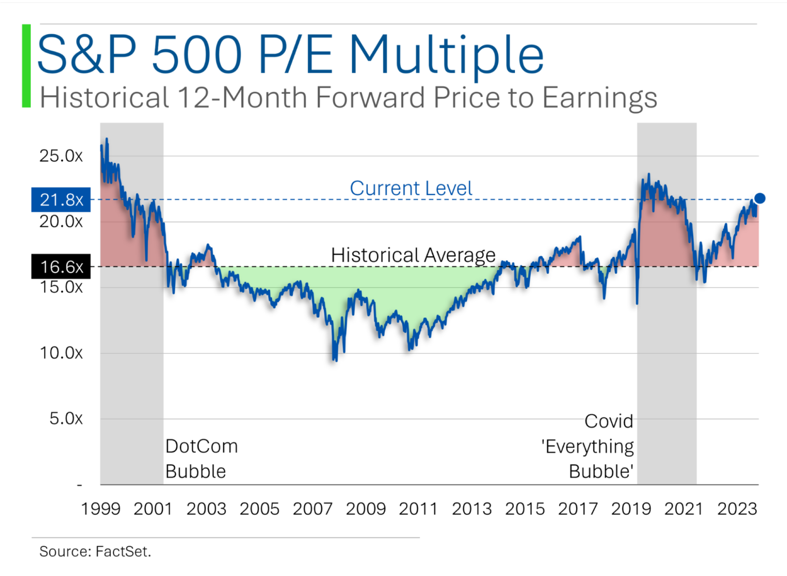
Goldman Sachs had suggested – admitting that it was something of a guess, to be fair – that the US stock market might grow at an annualized rate of 3% over the company decade. One reason is the high multiple US stocks currently trade at, as evidenced by this graph from Ryan of MarketLab.
Anyway, on one hand, forecasts are nonsense, but on the other, every investment we make arguably embeds some forecast – I own Berkshire Hathaway (NYSE: $BRK-B), for example, because I “forecast” (in a manner of speaking) that Berkshire will continue to slug along as it has done in recent years, modestly outperforming the S&P 500 on a risk-adjusted basis, owing to the sustained and slightly compounding effects of Berkshire’s way of magnetizing ethical, superior managers (on the private side) and its cult-like, hold-forever shareholder base that spares the stock from undue volatility.
Anyway, Goldman’s forecast caused quite a stir, and various commenters are commenting on it.
Here are a few points in favor of it, and not in favor of it.
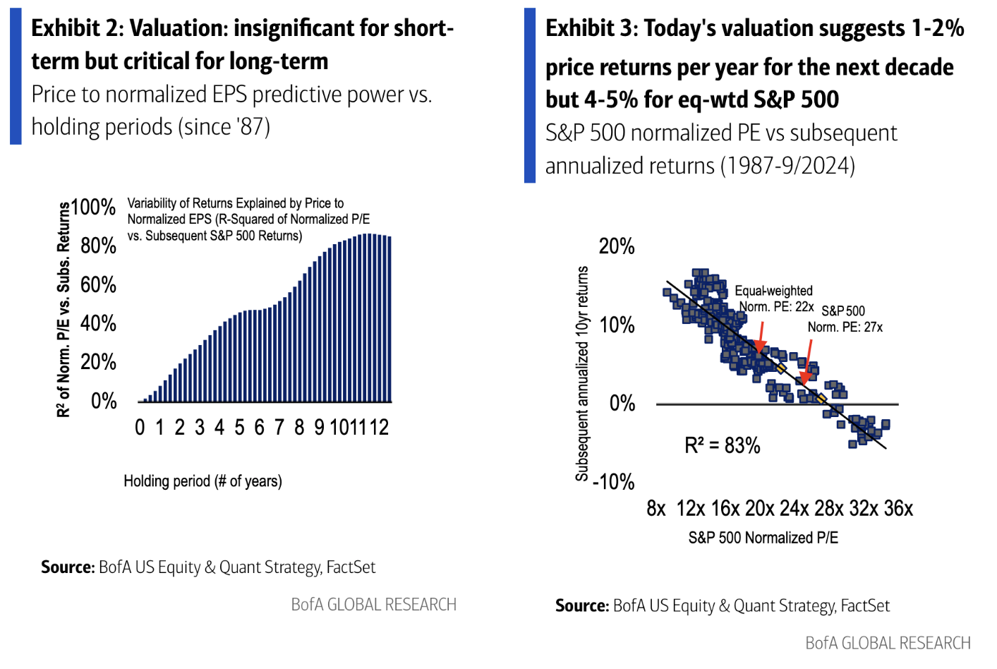
Bank of America, as Sam Ro of Tker.co points out, suggests that on a P/E basis, today’s market is indeed rich, and might deliver just 1%-2% (slightly less than Goldman’s forecast, even) returns – but a bit more than twice that for the equal weight S&P 500. The equal weight S&P 500 historically outperforms the regular one, by the way.
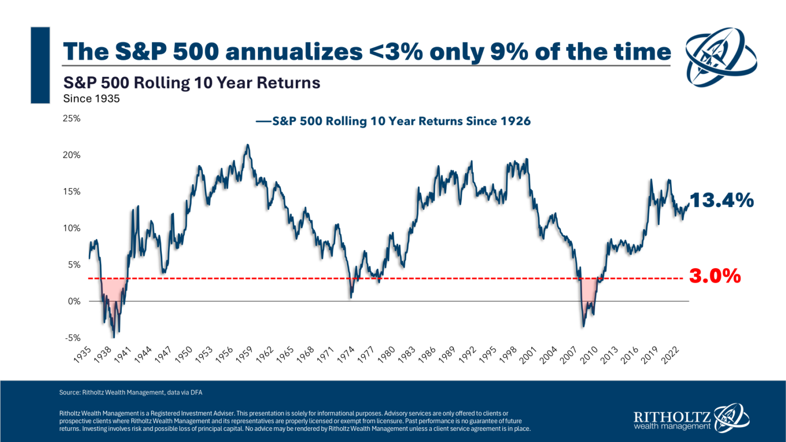
In the “against” camp is Ben Carlson from Barry Ritholtz’s Ritholtz Wealth Management.
Granted, his methodology is simple – since 1926, the S&P 500 has delivered 3% yearly returns on a rolling 10-year basis less than 9% of the time – but to be fair, neither Goldman’s nor Bank of America’s is particularly sophisticated, to my knowledge.
Who’s going to be right? Again, this is predicting the unpredictable. What follows is one more data point, though.
High-yield spreads are really low
Bonds don’t, at first glance, appear to affect equity holders. But if companies have a hard time paying their debts, it’s bad for their finances – both now, and their ability to borrow money in the future – and that’s bad for stockholders, too.
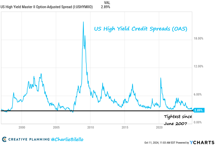
Charlie Bilello points out that the additional yield that junk bonds (now called “high yield bonds”) command over risk-free Treasuries is the lowest it’s been since 2007. This means that investors are, relatively speaking, paying a lot for junk bonds – because bonds pay fixed payouts, higher prices mathematically mean lower yields.
The issue, as Charlie notes, is that these periods have been followed by periods of below-average returns in both equity and credit markets: just 2.9% annually over the following five years (12/1996 to present) when credit spreads were in the tightest quintile versus 11.7% when they were in the widest.
So this credit spread is data point in support of Goldman’s gloom.
Possibly the two weirdest charts in all investing:
One more “expensive or cheap?” nugget before we move on.
Ryan at MarketLab (who I strangely can’t get to respond to my kind emails; perhaps they’re going to his junk folder) makes good graphics, but these two are so weird that I wanted to share – partly for the oddity factor alone.
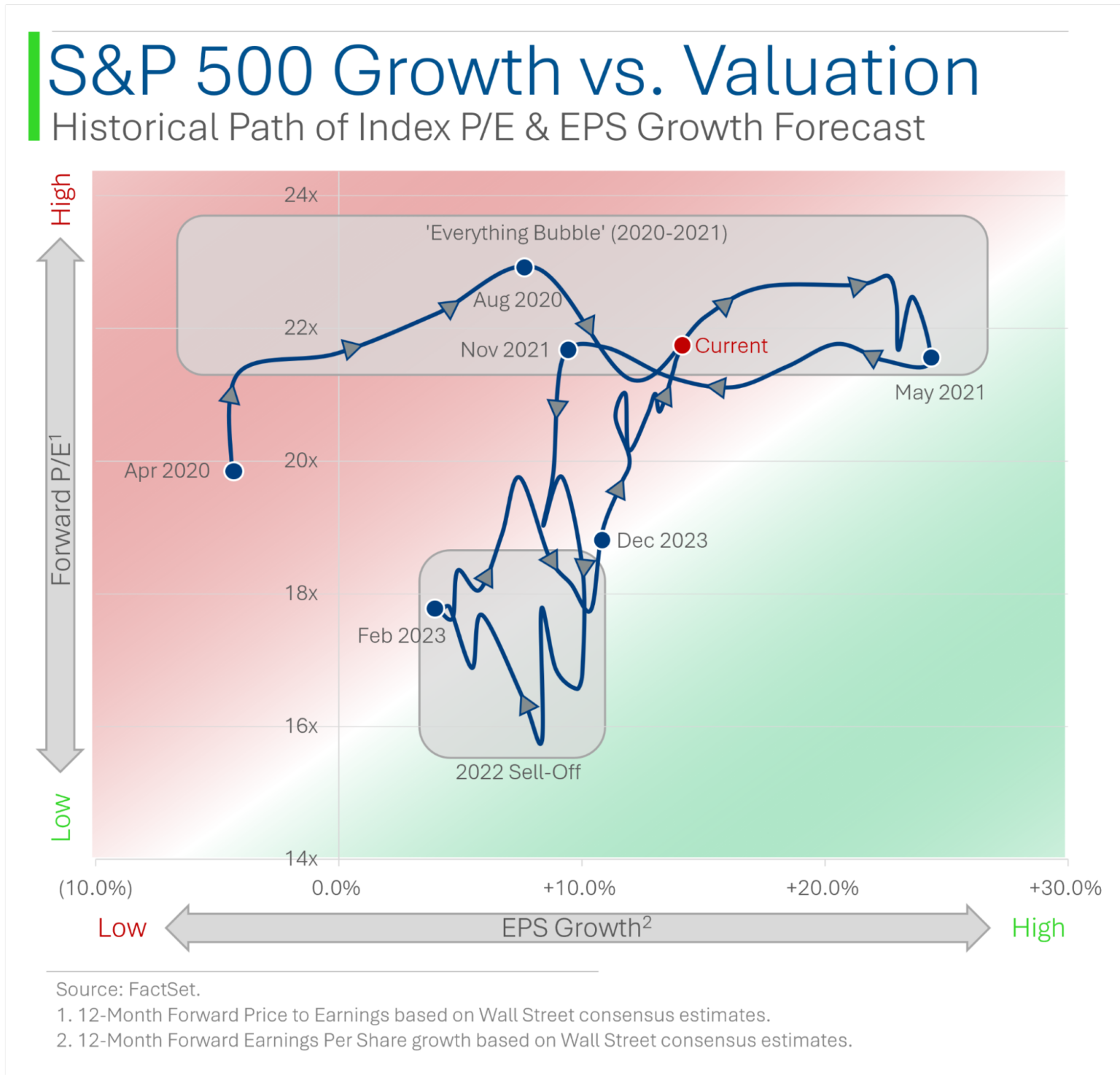
To understand the first one, forget about the “normal” left-to-right time series you’re used to. “Up and down” on the graph represents forward P/E and left-to-right represents future expected earnings growth (expected by Wall Street analysts). The line itself represents time.
Basically, the more in the green on this chart – to the bottom right corner – the better. You’re getting higher earnings growth for a lower forward P/E. Upper left corner is worse; it’s the opposite.
Ryan’s first graph shows that valuations have been, scientifically speaking, “kinda bad” from just after the start of Covid in the US (April of 2020) until present, with the exception of 2022 – a year most investors might like to forget.
Now it’s time to lose your conscious mind even more.
Ryan’s second graph has more squiggles because it has a much longer time period: since March of 2000. It ditches the Christmas color scheme for a “strike zone:” Most of the time, stocks are balanced between forward P/E and forward EPS growth. We are currently on the expensive side of things: more than one standard deviation away from average, but not two.
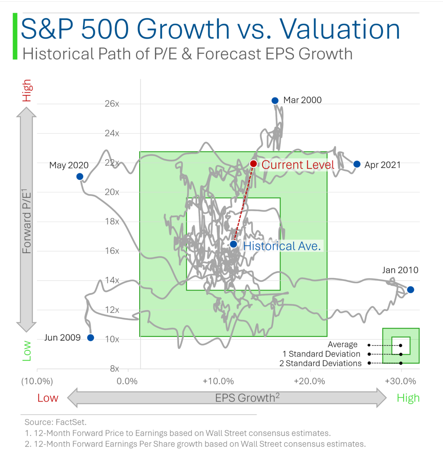
Ryan, only a madman would think to depict this data in a chart like this. And I mean that as a compliment.
Momentum is for real
Factors are reasons that investments go up or down.
In the purest sense, they could be anything from CEO haircut to P/E ratio to geopolitical uncertainties. (And if you habitually invest for reasons of CEO haircut, please reach out to me because I would like to interview you for the BBAE Podcast.)
As you might guess, “hard” factors like P/E, sales growth, ROE, and profit margin get a lot more love in academic research and among investors because they’re easier to quantify. This doesn’t automatically mean they’re better. But it’s probably true that if a group of factors becomes established in the communal psyche of investors as go-to factors that move stocks, those factors will, indeed move stocks. Language, cultural customs, and currencies work in a similar collective buy-in way, too.
Anyway, momentum was initially a black sheep factor. The purists – by which I mean the fundamental analysis types like Warren Buffett – would say that a stock should move up or down based on the company’s economic situation and prospects. Stock charts, especially when interpreted into arcane patterns, contain irrelevant information for fundamentalists.
Momentum, though, is literally the simplest way to read a chart. And thanks to the dissertation work of Cliff Asness (later of AQR Capital Management), it’s been getting more respect in recent years.
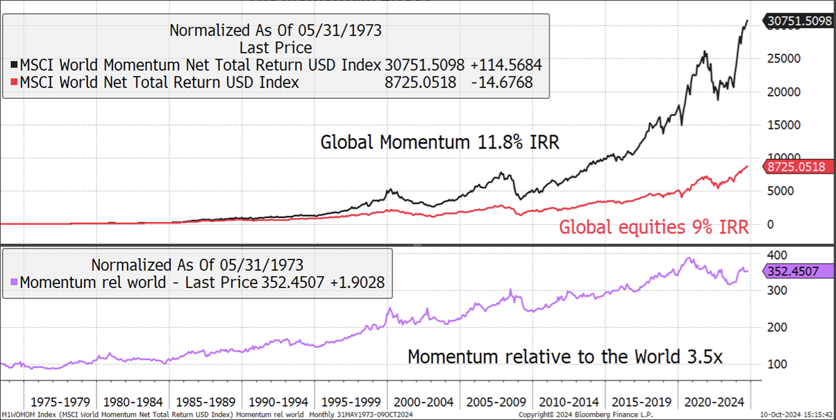
As with factor adoption, clothing styles, and currencies, the fact that other investors are doing something can have economic substance. Charlie Morris of ByteTree (and a friend of BBAE who’s been on our podcast) shared these Bloomberg charts showing the spread of an MSCI momentum index over a regular equities index over roughly the past 50 years.
It’s hard to make a case for ignoring momentum with this data.
What goes up (sometimes) comes down
I don’t like this saying in investing because over the long run, US stocks have, generally, always gone up. This is because they’re closely connected to human economic progress, which has generally always gone up.
But energy stocks, darlings not long ago, and recipients of a lot of anti-ESG investment money, have started to lag:
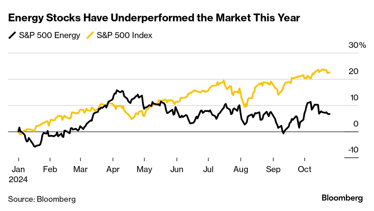
There’s no broader lesson here in my mind aside from the fact that sector or industry-type rotations strategies are very hard.
Things go in and out of fashion really quickly on Wall Street. Add anticipation and reflexivity on top of that – investors anticipate what’s going to be hot before it’s hot, making timing investing for the actual economic hotness hard, and investors often pile on and invest because other investors are investing (i.e., for reasons apart from economic hotness, even if anticipated economic hotness started it all) – and it gets even more confusing.
I’m biased, and other investors have succeeded with other strategies, but I personally feel it’s easier for most investors to either buy the entire market (such as with a Vanguard ETF) or buy and hold stocks of well-run businesses for the long run.
Jumping in and out of sectors is a tough way to make a buck, at least in my view.
This article is for informational purposes only and is neither investment advice nor a solicitation to buy or sell securities. All investment involves inherent risks, including the total loss of principal, and past performance is not a guarantee of future results. Always conduct thorough research or consult with a financial expert before making any investment decisions. James owns shares of Berkshire Hathaway. BBAE has no position in any investment mentioned.


