News Roundup: Healthy US Stock Market, Gold Bug Chart Crime, Mag7 Bubble vs. Dot.com, DJIA Goofy Index
Starting point matters
And you thought US stocks were on a tear.
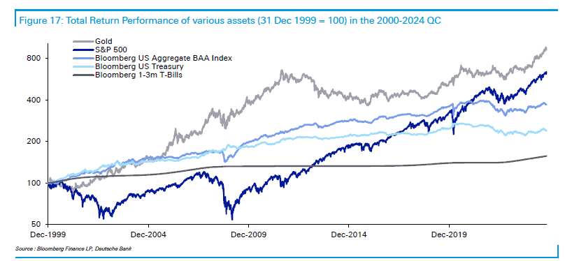
Per Bloomberg, and according to Deutsche Bank: US equities are actually on track for their second-worst performance over the past 25 years when adjusting returns for inflation. See the gray line below, which is gold – and which, despite warnings from anti-gold experts like Wharton professor Jeremy Siegel – has beaten the S&P 500 over the past 25 years.
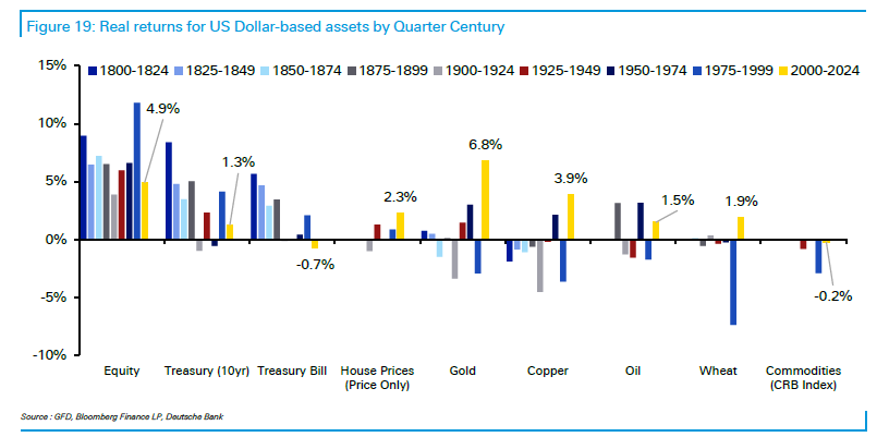
And if you’re a bar chart type, here are the real returns – “real” means adjusted for inflation – of various type buckets, with 2000-2024 in yellow. You can see that US equities delivered 4.9% per annum after inflation, versus 6.8% for gold.
Fair enough.
Does this mean gold is good and the anti-gold crowd is just wrong? Not necessarily. As Bloomberg pointed out, adjust the timeline to start from 1995 and US equity returns became the third-best in the sample.
Starting point matters.
I’m not against gold, but it’s easy to commit chart crime with it, as BBAE friend Brian Feroldi might say.
Magnificent 7 healthier than Dot.com bubble
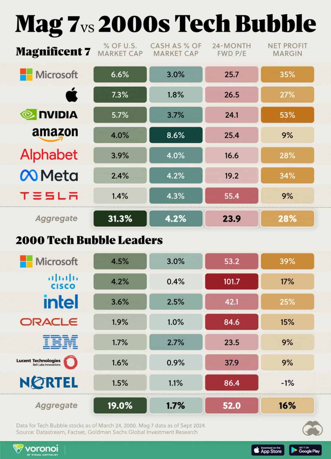
A quick comment on a quick graphic from Visual Capitalist. The Magnificent 7 now make up 31.3% of the US market cap and have a 23.9 forward P/E. Their profit margin is a robust 28%, and their cash was 4.2% of their market cap.
A quarter century ago, the top seven tech stocks – Visual Capitalist decided to look just at tech companies; 2000’s literal top seven companies by market cap would have included General Electric, Walmart, Exxon Mobil, and NTT Docomo – had just 19% of the US market cap. This comparison is arguably a touch misleading because the actual top seven stocks in 2000 (which itself was a bubble year) undoubtedly made up more than 19% of US market cap.
But it’s interesting to note that the 2000 “tech top 7” stocks had a 50 forward P/E, just a 16% net margin, and 1.7% of their market cap in cash.
Today’s market may be more topheavy, but at least the companies are more cheaply valued and financially healthier. They’d better be, because the 2000 tech bubble crashed and many larger stocks took a decade to earn back into their valuations.
The rich pay taxes, but who’s rich?
I’m a big Scott Galloway fan. Left-leaning Scott bleeds authenticity. He’s one of the best communicators around. He donates massively to charity.
One of his themes is how much the rich avoid taxes.
“The tax code has gone from 400 pages to 4,000, and that extra 3600 pages are to turn rich people into super rich … Tax avoidance is a key skill to building wealth.” Scott told The Diary of a CEO podcast, as quoted by Yahoo! Finance.
I’m not taking sides in this until I do more research, but I’ll point out that the Heritage Foundation (which puts out generally respected research, though it’s likely not funded by poor people) has an infographic showing that Americans earning $700,000 per year or more punch far above their weight in paying taxes:
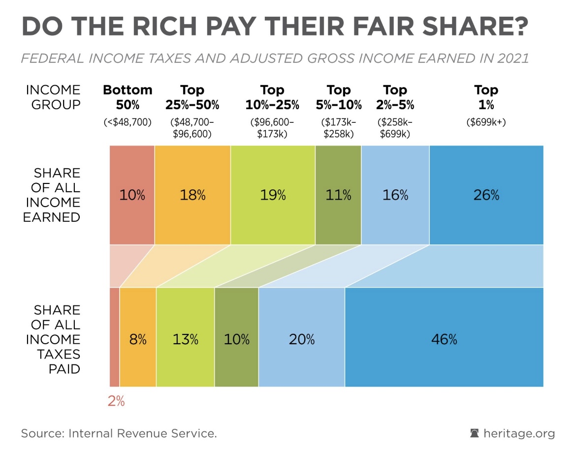
Actually, I don’t think Scott would entirely disagree. His “rich” is more like the super rich – not high earners on the far end of the upper middle class, often living in extremely high cost Zip codes.
US equity return profile looks healthy
The are two ways to make money in stocks:
- Multiple expansion: Investors decide to pay more for the same earnings
- Earnings expansion: Company earns more while investors hold P/E roughly the same
Some people add a third, but it’s impure:
- Dividends and buybacks
I say “impure” because these are a source of returns, in a kinda/sorta sense, but they use up company cash – a constituent of company value. So on an immediate transaction level, they’re valuation neutral. A company that has, say, $20 million in cash and chooses to pay out $4 million in dividends becomes, or should become, valued as a company with $16 million in the bank. (Exchanges adjust the stock price by the amount of the dividend, too.)
Buybacks are good for shareholders if, in retrospect, they are done at “cheap” stock prices – because shareholders are getting a good deal. They’re bad when done at expensive stock prices. Dividends, likewise, represent increased utility to investors: Investors can either spend or reinvest their dividends, which represents a choice, although dividends are taxed.
But in a simpler sense, if a company earns $10 and pays you $4 of that, you’d mathematically count the $4 as part of your return.
BlackRock has broken down the components of total return – using the logic of the last sentence above for dividends – and while dividends aren’t a big force in our Magnificent 7-driven market, earnings and multiple expansion are close to roughly matched, which indicates an optimistic market where optimism is also matched by the economic reality of growing earnings.
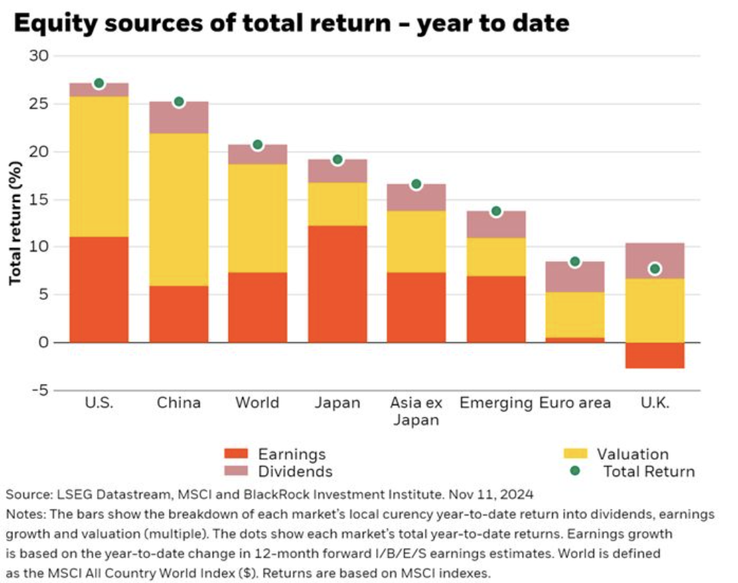
Asia ex-Japan is slightly more balanced, but given that the US’ total year-to-date return is nearly double Asia ex-Japan’s, I’d say we can’t complain.
Why the Dow (Jones Industrial Average) is Dumb
That’s just how we’ve always done things.
With the comfort of abstraction, anyone can acknowledge that these are dangerous words.
Put differently, incumbency has power. Sometimes too much.
As I’ve talked about before, there are different ways of making an index.
You could weight stocks by market cap, like the S&P 500 does. You could take some group of stocks and weight them all equally, like the equal-weight S&P 500 does.
Or you could just weight them by stock price – a $1,000 stock price has 10x the weight of a $100 stock price. This is what financial journalist Charles Dow did in the Customer’s Afternoon Letter, the precursor of the Wall Street Journal, which he published with statistician Edward Jones.
I am not faulting a financial journalist for creating a back-of-the-envelope calculation for what was, at the time, a two-page leaflet.
But it shows how long an idea that would never survive for a moment were it introduced today can last simply because it’s how we’ve always done things.
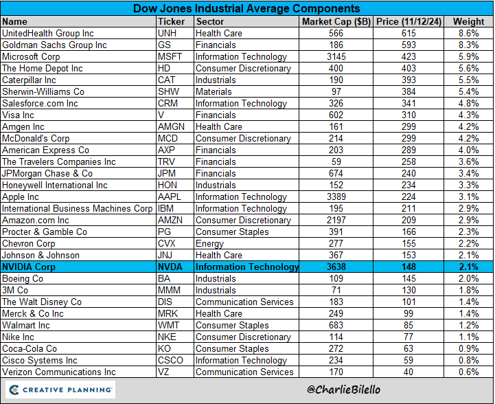
Charlie Bilello’s graphic shows how Nvidia (Nasdaq: $NVDA), now the world’s largest company by market cap, makes up a rink-dink 2% of the Dow Jones Industrial Average, where it recently replaced Intel (Nasdaq: INTC), and it’s simply because the stock price is lower.
A full 8.6% of the DJIA is determined by insurer UnitedHealth, which has over four times the power to determine the DJIA’s index level than does Nvidia. But if Nvidia’s market cap were a boat, it could hold 6.6 UnitedHealths and still have room left over.
I suppose there are two ways to look at this:
Negative: This is one of those things that doesn’t make sense, and that everyone who observes it agrees that it doesn’t make sense. But we continue to use it anyway, demonstrating the lemming-like nature of mankind; our willingness to do something irrational essentially in perpetuity, or at least barring some seismic disturbance, simply because it’s always been done that way and everyone else seems to be going along with it, too.
Positive: The fact that irrationalities can exist and persist for so long in plain sight is wonderful news for investors. Would you rather be competing in a market against rational investors who quickly correct mistakes, or against people who have widgets set up to track the DJIA by the hour?
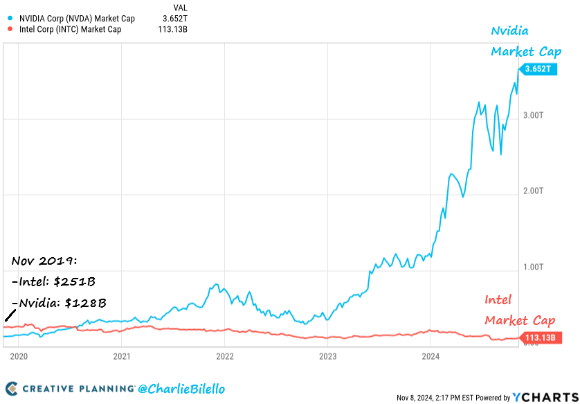
For kicks, here’s another graphic from Charlie showing just how much Nvidia’s stock price has thumped Intel’s over the past five years.
This article is for informational purposes only and is neither investment advice nor a solicitation to buy or sell securities. All investment involves inherent risks, including the total loss of principal, and past performance is not a guarantee of future results. Always conduct thorough research or consult with a financial expert before making any investment decisions. Neither the author nor BBAE has a position in any investment mentioned.


