
Weekly Roundup: Nvidia Falls, Recession, Bad September, 31 Years of 10% Gains
Nvidia Falls
Nvidia (Nasdaq: $NVDA)
Although long-term Nvidia investors don’t have too much to complain about – the stock is up 120% year-to-date – the GPU company (which has made up as much as 8% of the S&P 500 recently, though that’s down to a still-impressive 6.something percent) has raised eyebrows lately for how fast it’s fallen.
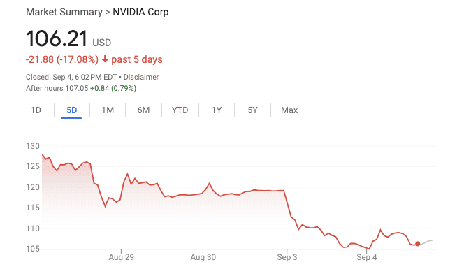
The most recent catalyst was news of the DOJ’s subpoena to Nvidia (registration may be required, though this should be a free-to-view link) to evaluate potential antitrust behavior.
But before that, there were Nvidia’s quarterly results which, by any standard, were phenomenally awesome.
The stock market, though, moves on surprise, or at least variance from expectation. When the market has priced in “really super phenomenally awesome” results, and a company delivers results that are “super phenomenally awesome” or – gulp – just “phenomenally awesome,” the stock will go down.
(Note that the inversion of this is the premise of value investing, at least in its original form: A low-expectation company, which might even be a lousy company you wouldn’t want to own for any long stretch, can deliver good gains by delivering results that are just “poor” instead of “really poor.”)
A chart from Charlie Bilello of Creative Planning puts a visual to this expectation-vs.-results concept for Nvidia. It shows yearly stock price gains versus revenue gains (both in percentages) for the past 14 years.
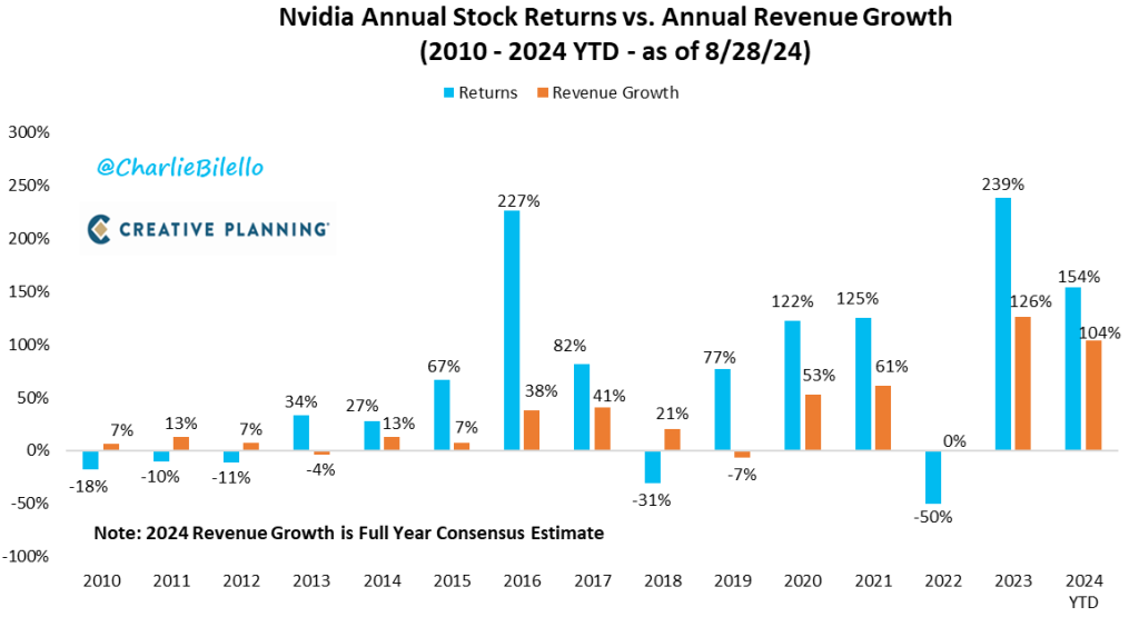
Yes, the stock market is anticipatory, so you wouldn’t expect this to line up perfectly (stock moves normally precede revenue moves), and yes, revenue is not as relevant as earnings, theoretically speaking, but for a growthy stock like Nvidia, it’s a legitimate proxy for what investors are watching.
The point? You see a lot more blue than red on the chart.
Over the past half-year or so, Nvidia’s price-to-sales (P/S) ratio has roughly halved, from 52 to 27, but that still means that if Nvidia suddenly had no expenses at all – no staff, no taxes, whatever else – it would take 27 years at the current revenue level for an investor to simply get his or her money back.
Not make any profit, mind you – we’re just talking just return of capital.
Now, 27 years is better than 52 years, and represents a quick move in the right direction.
But the S&P 500’s historical median P/S ratio is 1.5 (it’s a frothy 2.7 now, thanks in part to Nvidia and other “expensive” tech stocks), so Nvidia may still be embedding a lot more potential downward surprise than upward.
September: Worst Month for Stocks
I’m skeptical of data mining in investing.
As with professional sports, the demand for salacious or surprising statistics exceeds supply, leading for statistics that reach a bit: It might be interesting to know that a football team is 14 for 27 in third-down conversions when inside the opposing teams’ 17-yard line and when the opposing team is wearing pastel colors, but I’m not sure how predictive such a figure is.
So we analysts tend to look for economic logic behind investing stats, to see if they might hold weight, or are just statistical artifacts.
One surprising stat with no (known) economic logic that I still put stock in is the poor performance of September. For whatever reason, September has been a bad month for stocks, as this graph from Ryan of MarketLab shows:
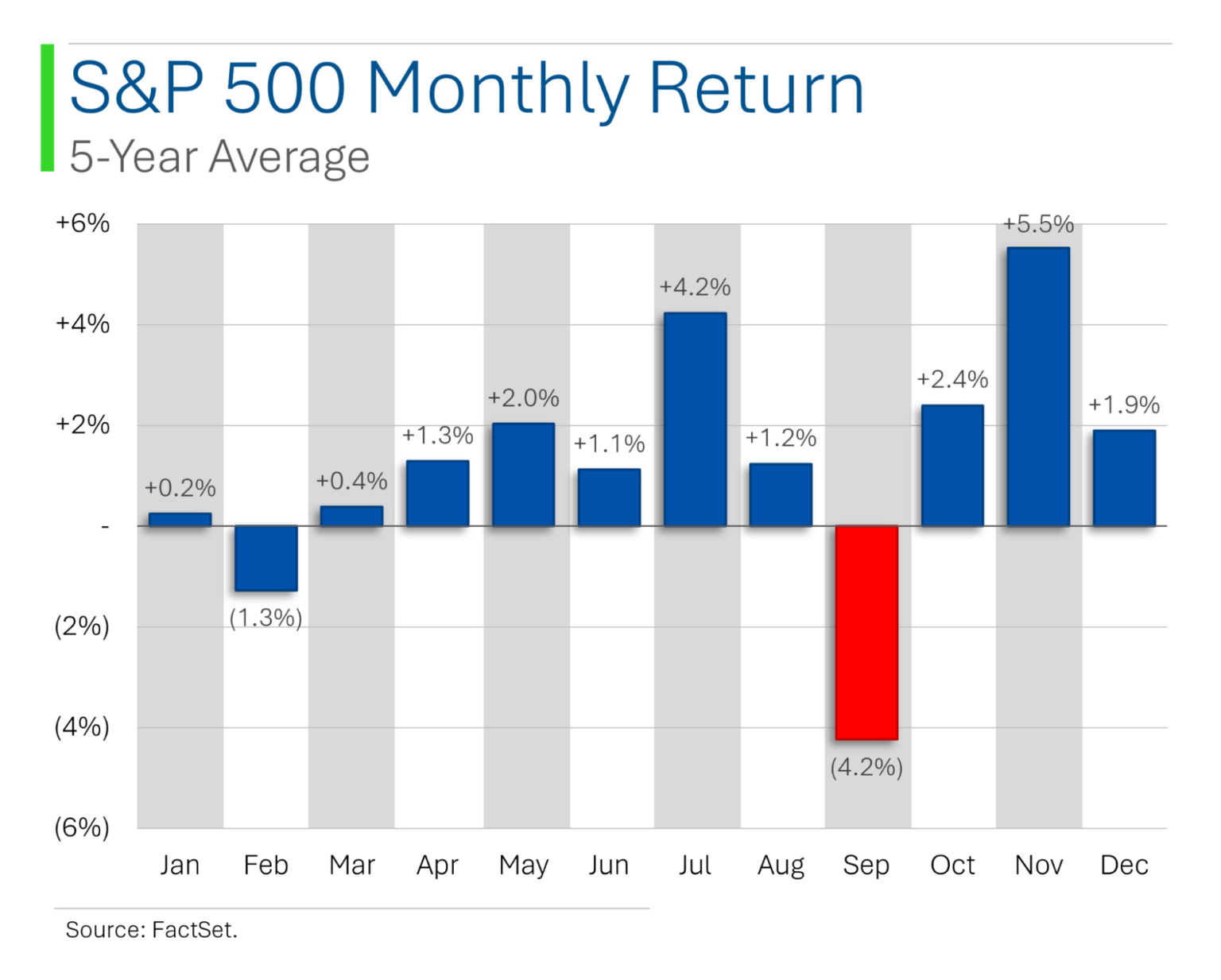
One hypothesis (registration may be required) is that traders go on vacation in August and feel sluggish and drained of optimism coming back to work, and (perhaps oxymoronically) “moved” by their ennui, dump a lot of holdings.
Even if this indeed happened the first year or few years, with the way economics works, if other traders are aware that vacationing traders are dumping stocks for irrational reasons, they’d use September as an opportunity to pounce.
Unless there’s a bona fide structural reason for an inefficiency to not get traded away (for example, big money institutions often can’t by microcaps, either by charter or because practically, they’d move prices too much and their aggregate gains would be too small), things like this get traded away.
But the September slump persists, with no explanation, and no trading away, either.
Fingers crossed that this September will be different – but it hasn’t been so far, with many equity indexes down between 2% and 3% as I type.
Investors: 31-Year Stock Math is in Your Favor
Barry Ritholz is a former blogging money manager who now employs a roster of blogging money managers, and they put out sensible stuff.
One such blogger is Ben Carlson, who published an article with a graph on the S&P 500’s returns since 1993, which was 31 years ago. (I remember 1993 like it was, well, not 31 years ago.)
The graph looks weird but just shows the annual returns for a given number of years ahead, starting from the first trading day of the year shown.
The first row, for instance, is simply the return for the year listed.
The second row shows the annualized returns for that year plus the year ahead.
And so forth, all the way down to the box showing that for the 31 years following January 4th, 1993 (which looks to be the first trading day of 1993), the S&P 500’s annual average return was 10%.
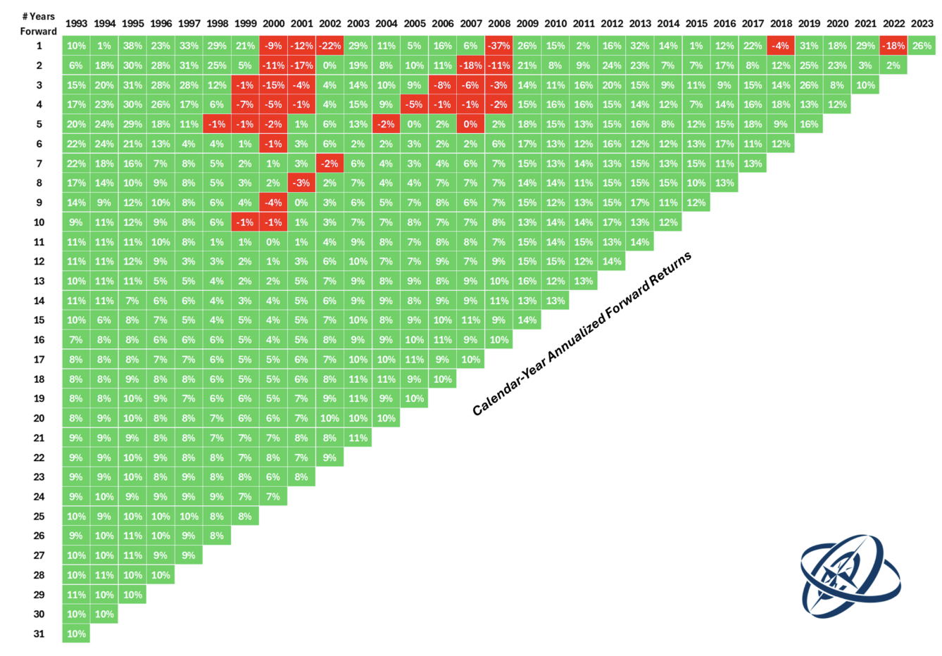
What stands out?
All the green, first of all. As I often say (and show), the stock market in aggregate is basically a bet on the progress of humanity – at least in the US – and because humanity generally creates economic value, the stock market generally goes up.
The second is how “confined” the drawdown years are, and how quickly the losses get absorbed. A 31-year time period is not short, but it’s not long, either. Still, even after the fourth year ahead, we’re talking annualized losses of 1% and 2% in a minority of years – i.e., for those who bought at the very worst times. But even those get washed out quickly.
If you’ve bought and held an S&P 500 ETF for multi-year horizons, it’s been literally impossible to lose money if your holding period has been long enough.
Now, “impossible” is based on prior data, and I suppose there’s some chance the US’ future is very different from its past, but I strongly doubt it.
Regardless of whatever investment style you find the most exciting or most likely to “click” with your ethos, having a baseline portion of your portfolio in broad-market index assets is a move recommended by all the financial advisors I’m aware of. The green on the chart is why.
You can’t go wrong with a low-cost S&P 500 index ETF (or mutual fund) but BBAE’s exclusive MarketGrader index portfolios have delivered higher bang-for-risk-adjusted-buck than the S&P 500. We think they’re a great alternative for investors wanting to optimize their baseline holdings, and you can read more about them here and see what you think, too.
Recession Coming Soon?
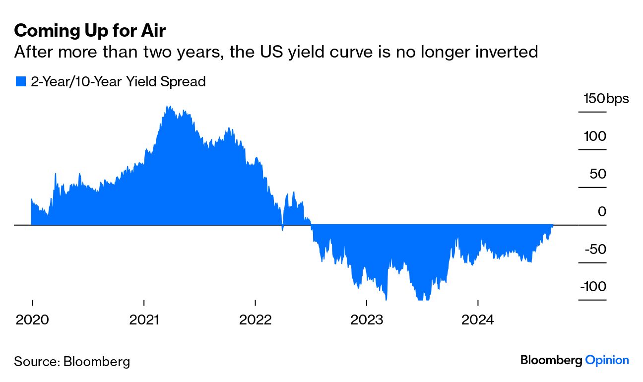
John Authers of Bloomberg has a contrary take on a contrary take. The inverted yield curve has long been a recession predictor, but that measure has been colossally wrong for a few years: We’ve had an inversion, along with the opposite of a recession – a strong economy, including a tight labor market.
| What’s the yield curve? A yield curve, which doesn’t have to be curve-shaped, is simply a plot of interest rates by time. The yield curve mentioned in US media is that of US government debt. Loosely speaking, the longer money is tied up, the higher the annual interest rate the person whose money is tied up wants to receive. Technically, bond money is not fully “tied up” in that you can sell bonds at any point, but the interest rate is tied up – the risk being if new bonds start paying higher rates, whoever bought the old, lower-yielding bonds will be stuck receiving that lower rate for a long time. All else equal, 30-year debt pays a bit more than 20-year debt, which pays more than 10-year debt, which pays more than 2-year debt, etc. But all else is not equal, at least not lately. |
Supposedly, an inversion – which may have multiple measures but is most commonly proxied by the difference between 2-year Treasuries and 10-year Treasuries (there’s no agreed-upon “correct” inversion measure, and Fed Chair Jerome Powell personally prefers 3-month relative to 18-month rates) – happens when, roughly speaking as the theories vary in nuance, bond investors get worried about not just a recession but a subsequent rate-lowering by the Fed in response, and thus seek to “lock in” higher long-term yields by dumping short-term bonds and buying long-term bonds instead.
Anyway, the chart below – which measures the spread between two yield curves, and is not a yield curve itself – shows that the inversion period appears to be ending.
So what?
One perspective is that if the inverted yield curve – which, up until now, has predicted every US recession since 1956 – has lost its mojo (presumably because of overpowering central bank activity, though nobody knows why exactly), who cares what it does?
Another perspective might be that if the US economy did well even under the dark cloud of an inverted yield curve, it should do really well once the yield curve goes back to normal. (Remember, though, the yield curve is only as smart as bond market investors – it’s just a manifestation of their preferences.)
A third perspective – the John Authers one – is that if the normally bad inverted yield curve brought good tidings, the normally good regular yield curve will bring bad tidings – i.e., a normal yield curve is the new recession indicator.
In John’s words:
“When the curve inverts, it suggests investors are convinced that inflation and growth will be down long into the future, so 10-year yields will have to be lower. That doesn’t mean, however, that it’s great news that the curve has disinverted. Rather, history suggests that this is a signal that a recession is now truly imminent. Rate cuts in the next two years will be enough to ensure that shorter rates are lower than long ones.”
This is weird, but John’s logic is that for whatever reason, investors will leave the long end of the curve untouched or lightly touched, while the Federal Reserve’s cuts to the Fed Funds rate (not US Treasury rate) eventually work their way to the bond market.
Hmmm.
Much as I enjoy John’s ideas, and much as I think his recession call may be fully possible, I may not be fully appreciating his logic. It’s true that Fed Funds rates affect shorter-term exogenous rates first, but generally, the Fed Funds-Treasury connection is slightly looser than people might think, and I’m not sure why long rates wouldn’t move much.
John may be right, of course. Or a US recession may happen for other reasons, meaning a normal yield curve has not become a recession predictor, even if it might appear to be one in this instance. Or we may have no US recession at all.
The only thing I can say for sure is that it’s hard to be confident about economics.
This article is for informational purposes only and is neither investment advice nor a solicitation to buy or sell securities. All investment involves inherent risks, including the total loss of principal, and past performance is not a guarantee of future results. Always conduct thorough research or consult with a financial expert before making any investment decisions. Neither the author nor BBAE has a position in any investment mentioned.