

Weekly Roundup: Stock Picking is Back, Naughty September, Welfare State, Visa a Buy?
As I type this, the International Longshoremen’s Association – the striking dock workers – has agreed to suspend their strike. One of the biggest beneficiaries is bananas, which have been waiting in limbo at the ports.
But US stocks have been soft on fears that conflict between Israel and Iran – playing out in Lebanon and Gaza – will mushroom into a larger war. For now, oil prices are just slightly up.
Here’s what else is going on in markets:
Stock Picking is Back (For Now)
Remember all that stuff about stock picking being dead and just seven stocks driving most of the market in 2024 and the first half or so of 2024?
Well, that stuff went on paid leave, at least last quarter.
The Compound shared a graphic on Twitter (or X, but I saw a stat that a majority of people have given up on “X” and are back to calling it “Twitter”) showing a revenge of the little guys, at least for the moment: The average stock in the S&P 500 performed 1.7x better than the index, and 67% of the stocks in the S&P 500 outperformed the index.
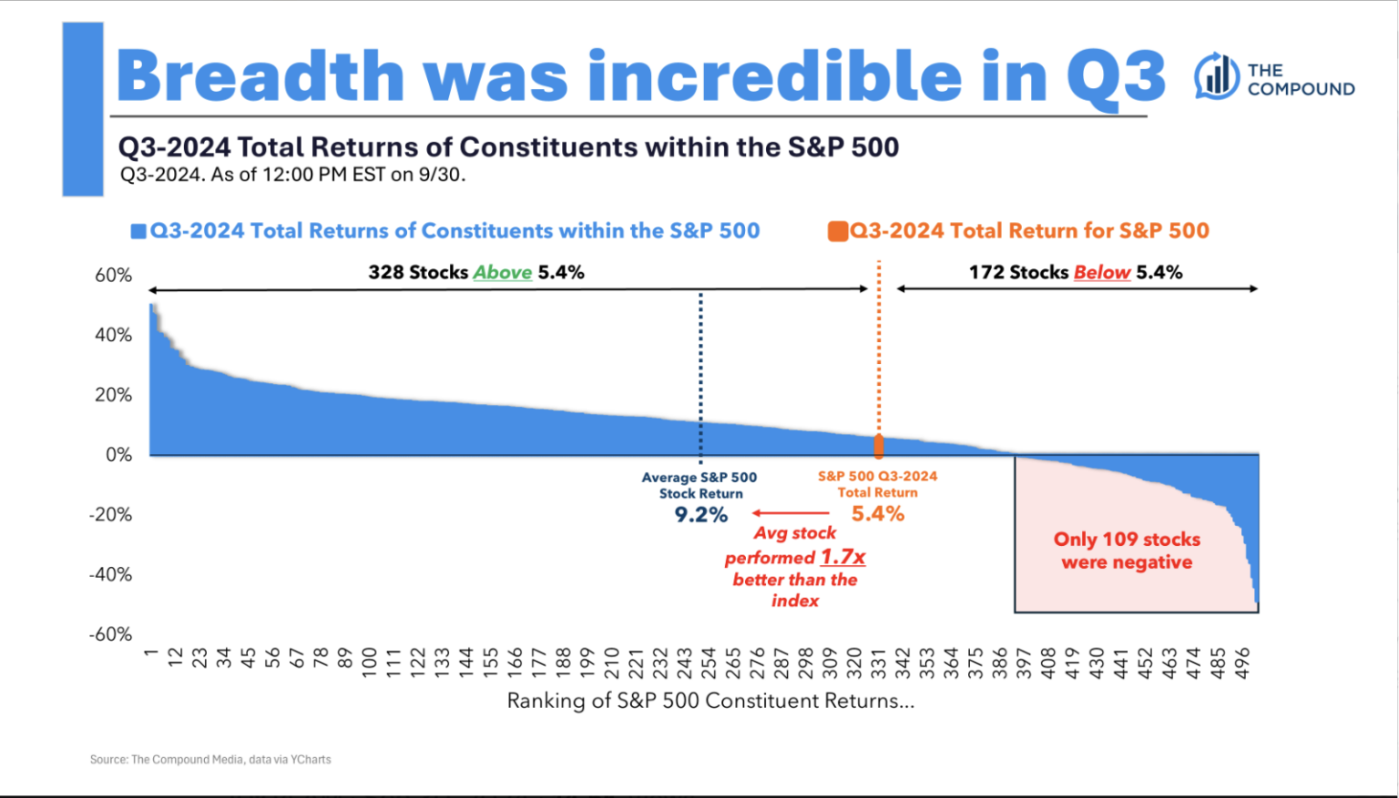
Presumably this from the Mag 7 doing a bit worse and the little guys doing better. (Though the S&P 500 is thought of as a large-cap index, most of the companies in it are mid caps, and some may be small caps.)
And Sam Ro of Tker.co pointed out that Bank of America’s Savita Subramanian showed that over time, just 31% of stocks in the S&P 500% beat the index in any given year.
As a side point, this echoes the “narrow markets” theme I’ve been mentioning over the past year or so: Over time, public equity markets are more akin to venture capital markets than we might expect, in that a small portion of companies drive the lion’s share of returns.
In other words, I’m surprised but not surprised by 31%.
Anyway, when it’s not just seven stocks doing the lifting, the logic goes, it’s a better market for stock pickers, because the market is noticing and rewarding idiosyncrasies more, which is healthier and more rational than blindly tapping “Click to Buy” on only the largest, hottest stocks. The only question is: How long will this last?
Why Enrique Abeyta likes Visa
BBAE crowd favorite stock picker Enrique Abetya recently shared why he’s watching Visa (NYSE: $V) stock. Enrique didn’t call it a recommendation, but rather walked through Visa through the lens of his three favorites stock-evaluation metrics.
These are Enrique’s evaluation metrics, and I make no warranty that they’re the best metrics, best metrics for you, etc. But part of growing and becoming a better investor is “trying on” what works for other investors – and keeping what you think will work for you while discarding what you think won’t.
Enrique has managed billions of dollars as an institutional fund manager, so he’s got street cred, but his style is pan-category. He doesn’t belong solely to any particular tribe: He’s not a value investor, he’s not a chartist, not a macro guy, not a crypto guy, but he employs pieces of each. His style is a mosaic; a mixed-breed dog of investing.
The first variable Enrique mentions is relative strength. The exact technical analysis indicator for relative strength is known as the relative strength index, or RSI. RSI is a momentum measure that compares a stock’s price movement relative to a benchmark. RSI ranges from 0 (a market pariah) to 100 (maximum market love).
A simple RSI strategy might be to buy when a stock’s RSI dips below 30 (suggesting the stock might be oversold) and to sell when it rises above 70 (suggesting the stock might be overbought).
What caught Enrique’s eye about Visa is how quickly it’s become oversold:
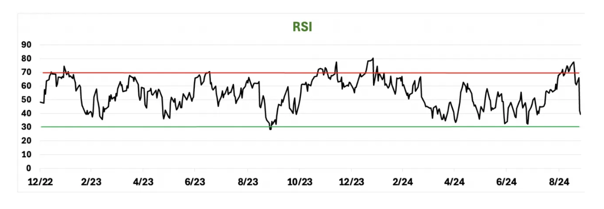
By RSI, Enrique likes Visa.
The second thing Enrique looks at is earnings revisions (or revenue revisions). He points out that broadly, Visa’s have trended up after a late 2022 bottom – another positive.
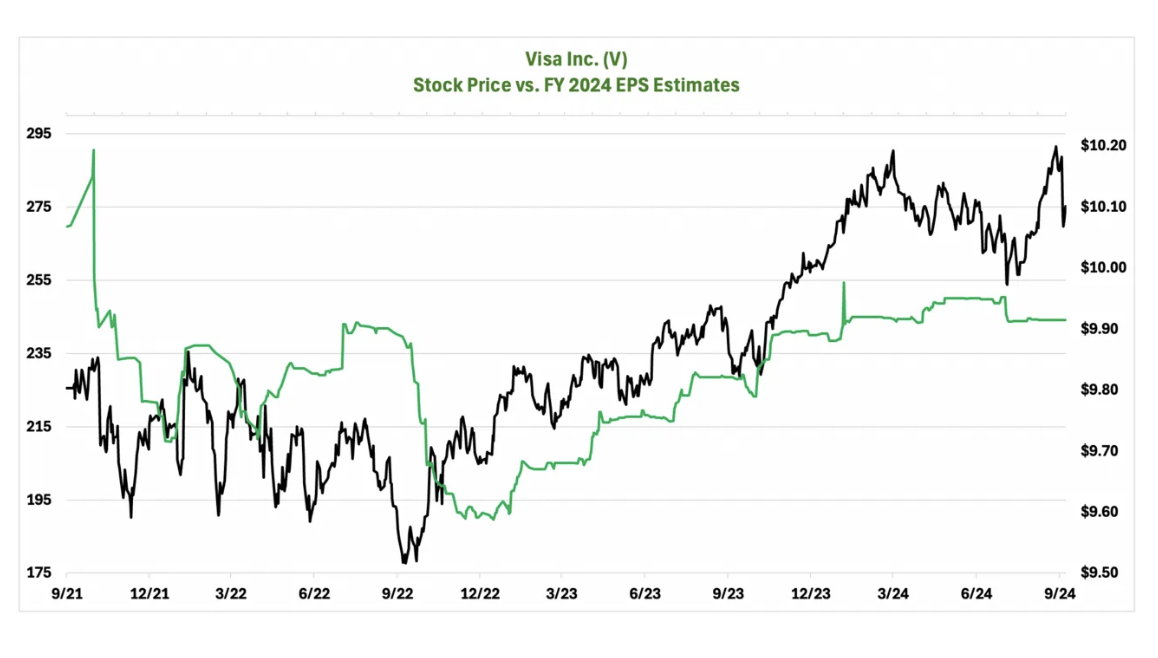
In fact, Visa has surprised to the upside in all but two quarters since the spring of 2019. Enrique calls this a second point in Visa’s favor.
The third leg of Enrique’s “quantamental” stool is just simple year-to-year earnings growth. This makes logical sense: A business is in business to generate earnings for its owners. Companies that consistently do this better and better every year are provably “onto something” in terms of superior business model and execution.
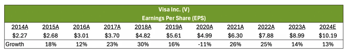
Visa, obviously, is a good business if it can generate double-digit earning growth every year for the past decade with the exception of Covid-year 2020.
Based on these, Enrique really likes Visa.
Of course, this is just Enrique’s quick screen, or one of them, and plenty of other investors would do things differently. But it takes two (or more) to make a market.
I like my beer cold and my profit margins fat
Actually, I don’t drink, so let’s focus on margins. Sam Ro of Tker.co shared a graph from Sherwood Analysis showing how rich US company profit margins have gotten since the pandemic:
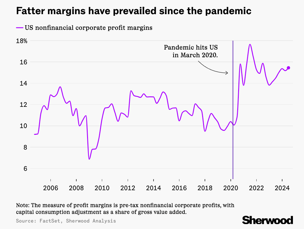
What does this mean? Companies – the ones you and I own stock in – are adding more value to the world.
What I’d be curious to see is a breakout of this trend by industry. I wonder if this chart is capitalization-weighted; if so, it’s possible that most of the regular non-Magnificent 7 companies are trudging along, same as ever, while the Mag 7 and perhaps some other big tech stocks that are structurally prone to having high margins just have more “vote.”
That wouldn’t make the graph unfair, as it still reflects some aggregate measure of US margins, and high-profit tech has grown to become a bigger part of the aggregate.
If this trend continues, it would be one of the anchor points for a “this time is different” argument that today’s American companies are structurally “better” and thus deserve permanently higher PEs than the high fixed cost industrial sluggards of yore.
We just made it through the worst of times (statistically)
I don’t remember subscribing to Ned Davis Research, but they suddenly started sending me stuff in my inbox. A lil’ spammy? Yes. But I’ve cited Ned Davis’ findings enough that I feel I owe them the karma of skimming their reports.
The below graphic shows that we’ve just passed the market’s darkest days, chronologically speaking:
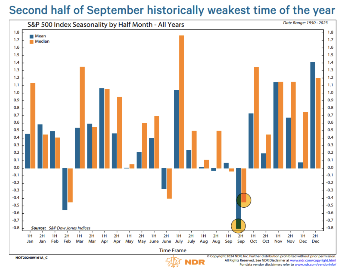
On one level, we can observe it. It is what it is, no matter how we feel about it.
But we’re allowed to feel something about it. That’s legal. The weird thing to me is the persistence of this market seasonality: Ned Davis’ data range is from 1950 to 2023.
The rational approach is this: If markets habitually drop in September – but then go right back up in the following months, as they have, on average, done according to this chart – if you’re a long-ish term investor, why not do the bulk of your buying in September, when stocks seem to frequently go on sale (or February and June, which are smaller sales months)?
This is what’s supposed to happen in a rational market. Free money doesn’t get left on the table for long. Savvy investors are supposed to come in and exploit such anomalies – i.e., investors should vacuum up stocks in September to the point where September no longer offers a discount buying opportunity.
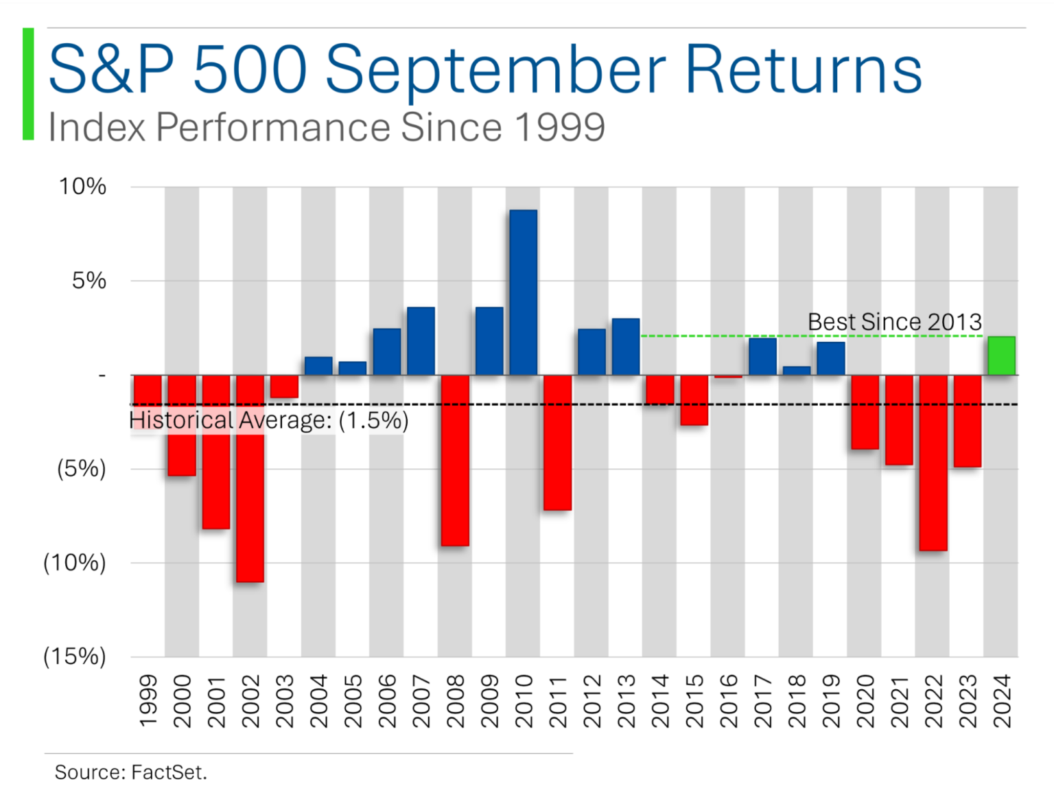
Reliably, Ryan from MarketLab showed September-only returns, albeing just from the past 25 years. As expected, not every September is bad. That may be one reason this anomaly hasn’t been traded away. Another might be that if you’re an investor and you’re exploiting this type of effect, you kinda sorta need to do it over multiple years to reliably capture the underlying tendency, and while that’s possible, it implies a lot of patience on the part of a fund’s investors.
If stocks were disproportionately cheap at 2pm or on Tuesdays, those anomalies would be traded away more quickly because the reward for exploiting them comes sooner.
Americans on the dole
The front page of The Wall Street Journal had a graphic that, while it’s not directly stock market-related, shows how much more government assistance has been swishing around in the US over the past 20+ years. It struck me (and, apparently, a lot of other people if it made the front page) as surprising, so I thought I’d share it here:
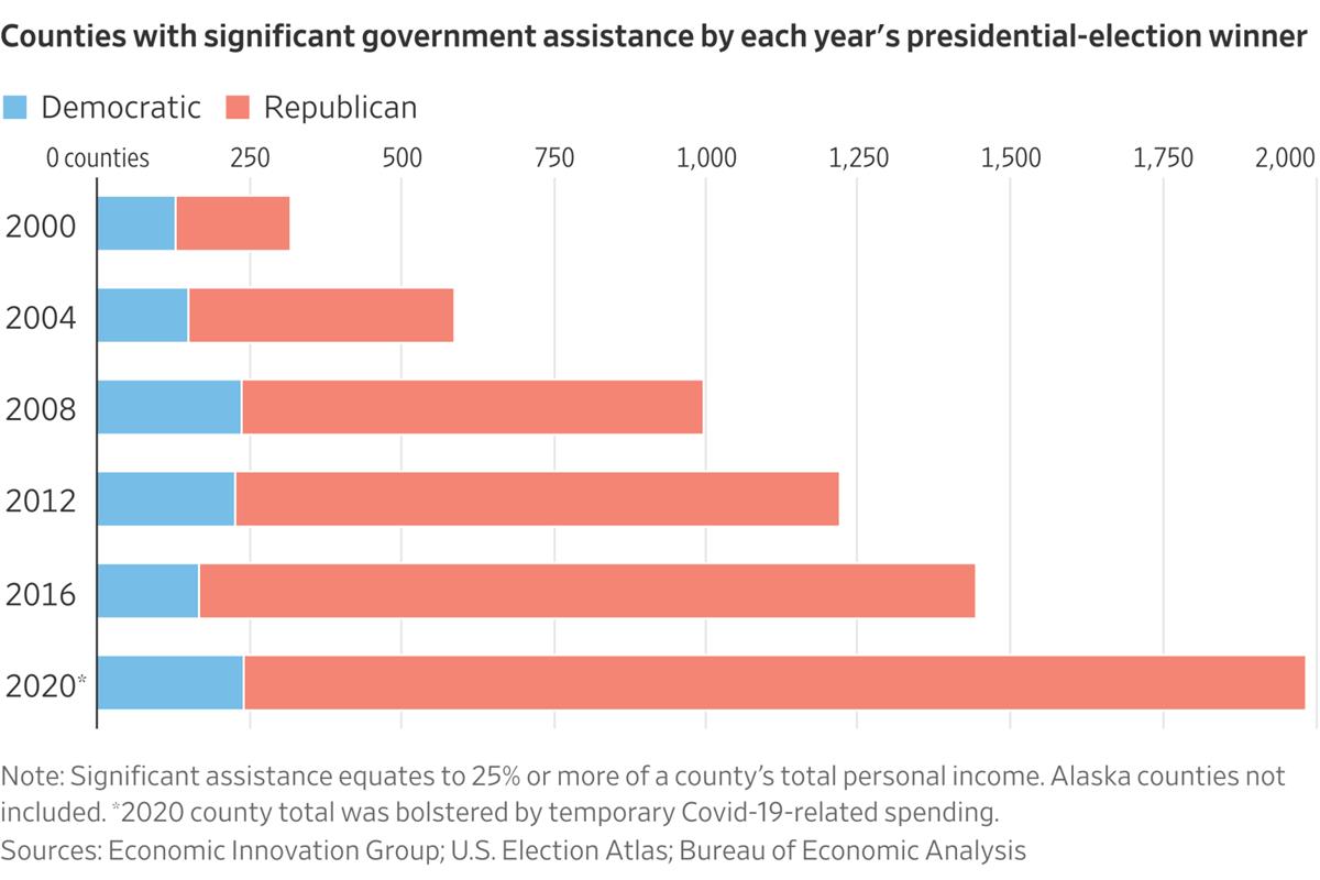
The fine print notes that 2020’s number was higher than “normal” because of Covid spending. I have no idea what the 2020 bar would look like with Covid spending factored out, but obviously (and sidestepping the political party aspect to focus on overall line lengths) the trend makes the US look like it’s headed for a welfare state, or something to that effect.
I’m not sure that’s true – the sky has been perpetually falling, and as Morgan Housel likes to say, pessimism usually sounds smarter than optimism – but, hey, nobody could accuse the US of being thrifty in recent years.
This article is for informational purposes only and is neither investment advice nor a solicitation to buy or sell securities. All investment involves inherent risks, including the total loss of principal, and past performance is not a guarantee of future results. Always conduct thorough research or consult with a financial expert before making any investment decisions. Neither the author nor BBAE has a position in any investment mentioned.